http://sylaep.blogspot.com/2011/09/introducing-artist-same-age-as-us-lee.html?showComment=1317025006749#c43632020341421122
http://st-art-lovin.blogspot.com/2011/09/key-chains-d.html
http://iamapurpleicicle.blogspot.com/2011/09/before-and-after.html?showComment=1317026129553#c2464758978269146042
http://ohmanitsming.blogspot.com/2011/06/pinholes.html?showComment=1317027247941#c6297010562950199588
http://chiawei-loves-colours.blogspot.com/2011/09/doodles-ddd.html?showComment=1317028863759#c9092755842805749530
Monday, September 26, 2011
Sunday, September 25, 2011
EOY2010 Street Scene by Liu Kang, 1956
 |
| Street Scene by Liu Kang, 1956 oil on canvas 128 x 84 cm |
The work shows a street scene which is probably situated in Bali. This is because Liu Kang went to Bali with the other pioneer artist such as Chen Cheong Swee in 1952. He was influenced by the naive innocence untouched by urbanization in Bali. Another clue is that the women in the work are dressed in colourful Batik sarongs which is the typical type of clothing that women wear in Bali. In the foreground of the picture, there are 4 women, 1 sitting on the floor dressed in a dark green blouse with flower prints with her back facing the viewer. Her hair is wrapped in a cream coloured cloth. To her left, there is a woman wearing a striped white shirt and bright orange sarong with black bird prints. She is sitting on a stool. In front of her, is a table with fruits like bananas and mangoes on it. there are also jars with colourful contents on the table. Perhaps they are pickled fruits. To the left of the table, there a bunch of unripened bananas and some green and red fruits placed on the floor. Perhaps she is a fruit seller setting up her stall by the street. This shows the simple lives of Bali women.
At the background, there are more women dressed in batik sarongs.They seem to be getting arond with their everyday activities. One example is a mother bending down and picking up something while a young naked child is tugging at her sarong. This shows the innocence and purity of the people there.
Also in the background, there is a man with a straw hat carrying a stick behind the group of women. He seems to be transporting something. At the very back of the cork, there are 2 women.They are not drawn with much detail. The viewer only can tell their positions one women is carrying a basket on top of her head while the other is putting her left hand on her hip. They seem to be walking on the street.
The daily and simple activities that occur on the street in Bali is portrayed in this work. It shows that though their lives are simple, they work hard at their work and are a group of happy and contented people. Lui Kang did this work as he liked scenes that were rustic. On his trip to Bali, he was inspired by the simple, innocent, contented lives of the Bali people.
b)Discuss the use of colour, brushwork and pictorial space in this painting
Liu Kang uses complementary colours. One example is the women in the foreground mending her stall and the woman sitting behind her. The former is wearing a bright orange-pink sarong while the latter is wearing a dark green blouse. The juxtaposition of the 2 colours make both look brighter. Another example is the woman squatting down in the middle. Her Batik sarong is dark red while the dots on it are light green in colour. The use of complementary colours make the dots stand out. Perhaps this is to hint that although the lives of the Bali people seem boring and mundane, if you look closely, their lives are actually very colourful and interesting.
Liu Kang painted in flat areas of colours. Hence the paintings seems rather flat and 2- dimensional. However, he does use darker tones of the same colour to show shadows. This can be seen in the woman sitting in the foreground, sitting diagonally behind the fruit seller.Her arm has 2 different tones. This gives volume and a sense of roundness to her arms.
Depth is created by the size of objects and people and the amount of detail present . People in the foreground are larger in size and are painted with more detail while people in the background is smaller in size and have little detail. This can be seen in the 2 ladies at the very back, they are smaller in size and their facial features are not painted. However in the foreground, the details of the fruit seller's clothes are clearly painted, like the black bird prints on her sarong.
Other than the people and the important objects related to what they are doing, everything else is black. For example the space on the left centre of the work is completely black. This perhaps is an influence from chinese painting ,留白,where areas are kept empty to balance the composition and prevent it from being too cluttered. This perhaps done also to draw focus to the activities of the people.
c)Explain what is meant by the "Nanyang Style" and how the art of Liu Kang exemplifies this style. Discuss with reference to the work above and a named work by another Nanyng Artist.
Nanyang style is the use of art techniques influenced by both western art and eastern art to depict a subject matter that is unique to the 南洋 region, local subject matter.
The work probably depicts a street scene in Bali which is only Characteristic to the 南洋 region.
Liu kang uses bold black calligraphic strokes as outlines to show forms, this may be an influence from the chinese calligraphic strokes used in chinese ink painting. An influence from the western post-impressionism is that paint is applied in flat areas of colours. This is evident in the works of Gauguin .The forms in the work are simplified. This may be an influence from the chinese style "xieyihua" where only the essentials are kept, details are ignored. "Bali Girl" by Cheong Soo pieng shows the side profile of a Bali girl in a Batik sarong The left top corner of the work is left completely empty. This may be an influence from the chinese technique of 留白. The The Bali girl and the sarong that she is wearing is something that is local and cannot be found anywhere else in the world. She is unique to this 南洋 region. Hence the subject matter is local. The medium in which the painting is painted is oil, which is typically a western medium. Yet, the painting is painted with a chinese flavour.
Inspiration - Dawn Tan
She is an Artist, illustrator, art teacher, knitter, food lover, quiet observer, day dreamer, adventurer and the author of http://hand-made-love.blogspot.com/ and she lives in Melbourne and is a singaporean!
i think that she is a really cool! she loves food, and food inspires her work. She also really likes craft and draws and paints really well.
for example here, here and here.
Another reason i think she is cool is cos she does art for a living and we all know that that isnt easy. for example she encountered some difficulties that made her mood bad however this is what she wrote:"
Now, those meanies can go ahead and bring me down in whatever way they want to, but they will never ever be able to take the happiness I get from working in a creative space along my joy of making art away. "
i think she is a really contented and positive person. she is happy just doing her art although it is really difficult. Her attitude really inspires me (:
Inspiration - shopping does not buy you happiness, but a concert may
Shopping does not buy you happiness, but a concert may
the straits times
monday, may 30 2011
pg A24, review
link to the article
As mentioned in the article, "However, contrary to expectations, research has rebuffed this proposition by demonstrating that neither the ability to acquire nor the actual acquisition of material goods leads to sustainable increase in happiness.
Instead, it has found that this relationship is negative-increases in material possessions may well be accompanied by a decrease in happiness. This phenomenon, termed the "hedonic treadmill", says that as possessions increase, so do people's expectations. Over time, people become less sensitised towards their possessions and require even more new possessions just to sustain the same level of happiness as before. Essentially, their efforts at increasing happiness via material acquisitions are in vain."
As seen from the article, the more one has and one wants, the harder one is happy. i guess this explains why people in less developed countries are happier than people in more well-developed countries. And those who are poor tend to be happier than those who are rich.
so happiness is not so much on how much you have but if you are contented with what you have!
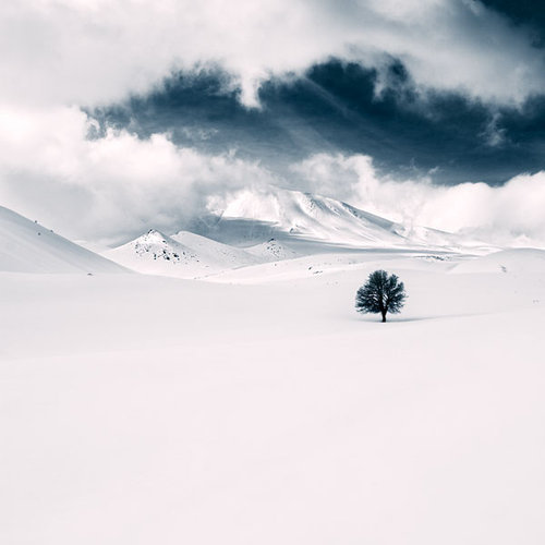
Inspiration - http://smileee.tumblr.com
i really dont know when i got to know this tumblr but i really like the things that the author posts. she (the person seems to be a female) encourages people to be happy,smile and to look at life in a positive light, have hope here are some examples:

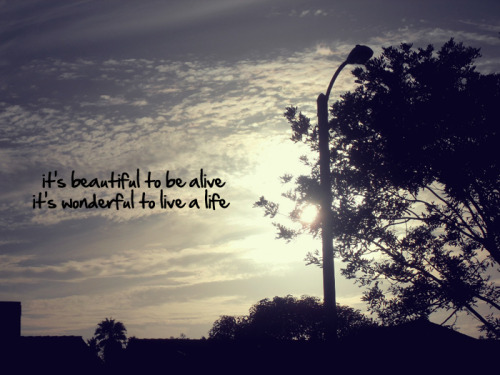


she also posts beautiful pictures of landscapes, Perhaps showing that the world is already so beautiful why cant we just be happy?


she also posts beautiful pictures of landscapes, Perhaps showing that the world is already so beautiful why cant we just be happy?
T.Venkanna ART Stage
 |
| T.Venkanna seated with a man infront of Frida Kahlo's The Two Fridas at Art Stage Singapore |
At Art Stage Singapore, a man dressed only in his "birthday suit" sat in front of Mexican artist Frida Kahlo's The Two Fridas. As part of the work, visitors could pay $250 to be seated next to him, hold his hand, and get a photograph taken.
T.Venkanna is an Indian artist known to be "one of his generation's most exciting, versatile, and unconventional artists." as quoted from Gallery Maskara's website. It is the gallery he represented at Art Stage Singapore. His art created quite a stir and there was controversy over if this was considered art and the appropriateness of his art at a public event.
So firstly, is this art? This would depend on one's definition of art. For me, art is self expression. Art is the expression of one's feelings, emotions, thoughts through any medium, be it drawing, painting, installation, performance, etc. Hence, i do consider his work art.
Secondly, is this good art? i feel that for art to be considered good, it has to be meaningful to the audience. If there is no connection between the art and the viewer, it would be just another performance, object or image, there is no significance to the work.
According to T.Venkanna, the meaning of his work is about "removing the trappings of identity". However, i find it rather difficult in understanding his work. The Two Fridas by Frida Kahlo is a self portrait about the pain, turmoil and struggle during her martial crisis. It shows 2 of her personalities, one that loves her husband and one that was abandoned by her husband.
i do acknowledge that there are some slight connections between the work and the meaning, however i find it very difficult to understand how sitting stark naked holding the hand of a visitor in front of the painting can show the removing of the outward signs, features, or objects associated with identity. Hence the work is not very meaningful to me.
Furthermore, i also do not understand how charging $250 for a picture with the artist in front of the painting contributes to the meaning of the work, that is the "removing (of) the trappings of identity". If taking a photo is necessary in the work, i am able to accept it, if collecting a token of money is necessary, i am able to accept it. However what i find very hard to accept is the charging of $250. $250 is not a small sum of money, hence it makes me wonder if the artist is doing his work for self expression or if he is just doing it for the sake of money.
As for whether the such work is appropriate to be shown at Art Stage, i think it is appropriate.
Before the event, "permission was sought from the Media Development Authority (MDA) before Venkanna's exhibit was given the go ahead."(quoted from asiaone.com) Furthermore," additional measures taken were to screen the exhibit from the public area to avoid visitors from stumbling upon it by accident."(quoted from the deputy director of Art Stage Singapore). This was done by
Mr T. Venkanna had sitting behind a black curtain and a sign warning viewers of the content and restricting viewers to those who are 21 years and older was posted in front of the booth.
Hence i feel that only those who knew what was the content of the work and of the appropriate age would see the work.
Furthermore, in other countries, works with more explicit content are also displayed in such a way, with signs warning viewers of the content. However instead of a restriction of age, the signs only encouraged parental supervision. For example at Centre Pompidou, there was an exhibition which contained some explicit content. That exhibition entrances were covered with black curtain and signs warning viewers of the content were placed outside. However i do acknowledge that these exhibitions probably did not have a real naked man behind the curtains.
As for the artist's responsibility in creating one's art, society expectations, modesty,virtues, where do we draw the line between self expression and the society? i feel that before the work is done, the artist has the responsibility to ask himself if this is the only way to express what he feels, is this the only and best way? if it is still yes, i feel that the artist should warn potential viewers of the content and approach the authorities of the society before doing his work. This is to ensure that Innocent by-standers would not stumble onto the work and feel uncomfortable and be scarred.
Overall, i felt that T. Venkanna's work lacked explanation and that Singapore's art culture is still not mature enough to accept such works.
Saturday, September 24, 2011
BT2,2011, Looking Ahead by Ng Eng Teng vs Growth by Han Sai Por
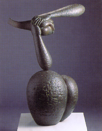 |
| Looking Ahead by Ng Eng Teng, 1987 Bronze,79 x 56 x 29 cm |
 |
| Growth by Han Sai Por, 1985 Marble, 111.2 x 88.5 x 40 cm |
a)Describe the subject matter of both works.
Looking Ahead by Ng Eng Teng shows a simplified head with 2 clasped hands holding it. The hands are at almost 90 degrees with the right elbow resting on 2 thighs with exaggerated proportions. The upper arms, the torso, the neck are all omitted while the thighs and legs are simplified into 2 round lumps which differ in size. The texture of the legs are much rougher than that of the lower arms and the hands. Among all the body parts, the texture of the face is the smoothest of all.
Coming out from the back of the head, is a long flat piece. It may suggest hair. The flat piece also seems to suggest movement of the head, as if it is flying forward. The facial features on the face are very simplified with eyes suggested by an indent and the nose suggested by a long thin protrusion. The mouth is also suggested by a small protrusion below the nose. Although the forms are rather simplified, the viewer is still able to tell that the face is looking forward. This is through the careful positioning of the head.
The omission of the upper arms, torso, and elimination of details such as the feet draw the viewer's attention to what is portrayed even more. The absence of the parts also create a presence as the viewer can imagine the positioning of the parts and is able to easily tell the body language of the body.
The work seems to suggest that the person is deep in thought looking at the distance, dreaming. Perhaps the work is to encourage the viewer to dream and look ahead beyond the problems and limitations that surround us now.
Growth by Han Sai Por is 5 carefully carved out pieces of white marble that are semi-abstract. They seem to be like shoots growing out of the ground. They all have a round bottom and a slightly pointed tip at the top.They are placed in a circle with each pointing in different directions. Although they are similar in their form, size and texture, they have small differences light their height, thickness, and the curves that make each of them unique in their own way. This makes them look interesting to look at and seem that they are alive.
They are all very well executed, the surface is polished till it is very smooth and have very smooth and soft lines. This is rather ironic as it is made of marble, something that is hard, brittle and cracks easily.
Because of their different heights and slightly different shapes, they seem to be like seedlings, fragile, soft, needing protection, yet at the same time full of life, curiosity and wanting to understand and discover the environment.
Through her sculptures, Hn Sai Por is able to make the work have a spirit that wants to break out, feeling of nature. It tells the audience of human's relationship with nature, that humans must protect nature.
b)Discuss similarities and differences that exist in their treatment of forms and use of materials
Both works are sculptures that have a meaning that each work is trying to show, they are not just pleasantly looking forms that are empty and meaningless. Looking ahead seems to be trying to encourage the viewer to dream, to look beyond the present. While Growth seems to suggest the beautiful silent beauty of nature and that we should protect it.
both works are simplified. They both do not have much details only the essential parts are kept. In looking ahead, Ng Eng Teng simplified the legs and thighs into just 2 lumps of different sizes. he also simplified the features of the face and omitted the upper arms,torso and legs. In Growth, Han Sai Por simplified the young seedlings to smooth teardrop-like forms, there is hardly any detail. However, despite their simplification, both works are still able to portray a message the artist is trying to express. The simplification further adds on to the clear message as there is less detail to distract the viewer.
However, both have differences. For Looking Ahead, the texture is rough, making it seem like the texture of rough granite. this can be seen in the lumps which portray legs. The arms also have a slightly rough texture. However in Growth, all the forms are painstakingly sanded down and are as smooth as baby's skin. Even the points, the tip of their teardrop-like forms is also smooth, not one bit prickly.
Another difference is the use of material. Looking Ahead uses bronze while Growth is made of marble. The difference is probably because the artist wanted the characteristics of the material he/she choose. Bronze is dark brown in colour and is durable. This is perhaps to suggest that our dreams and aspirations should last long, we should not give up.
Marble on the other hand is white, hard and brittle, yet it can be polished till very smooth. This is perhaps to symbolise the fragility and beauty of nature.
c)In your opinion, which work would you choose to be displayed in Nanyang Girls' High School as part of our permanent art collection and where will the chosen work be exhibited? Disscuss with consideration given to the artist's background, repertoire of works, approaches to art, etc.
I would choose Growth by Han Sai Por to be displayed in Nanyang. i would choose the green grass patch at the front gate of the school as the location. However, because of the size of the work, it could be placed on a raised platform.
i chose Growth for a few reasons.
Firstly, some of Han Sai Por's work is already in our school and this would add to the collection.
Secondly, Han Sai Por has taught in Nanyang as an art teacher before, hence it would be more meaningful to have her work in Nanyang.
Thirdly, i think the meaning of Growth is very suitable fro Nanyang.Growth seems to suggest little young seedlings in the midst of discovering their environment and growing up. This ties in very well with Nanyang. Nanyang is a plaace where young girls are given a good environment and the resources to discover about themselves, learning to grow and mature. In Nanyang we are given the protection and loving teachers to guide us. Hence the whole idea of growth that Growth presents is very apt for Nanyang.
Lastly, Han Sai Por Being a rather small and petite woman, has the courage and passion to pursue her interest in sculpture. she has to work with big machines, hard rock to slowly carve these rocks into her art pieces. I think that her attitude in life is very encouraging, to have the determination and courage to pursue an art career as an artist which is not popular in Singapore.Her determination and courage is very admirable and i think that she and her work will be a great inspiration to Nanyang Girls.
inspiration - Bhutan GNH
Bhutan is a small landlocked country in south Asia, it has a small population of about 700,000 people. However it is ranked one of the happiest countries in the world!(it was ranked happiest country in Asia by business week magazine in 2006)
i believe this is partly due to the fact that they pursue GNH instead of GDP.
GNH- Gross National Happiness
as the video explains, the pursuit of happiness > the pursuit of economic growth and materialistic wealth in Bhutan. despite not being very well off as a country, it is a very happy country.
so it is possible to be happy without having many things or having alot of money, what we need is the the right attitude.
inspiration - Trip to chiang rai
During the march holidays, i went to chiang rai for CIP, there i met some children,of whom some were orphans. they left a deep impression on me. they were always thankful, always happy, always contented, always laughing and having fun despite not having much
 |
| 5 of the children, part of their home in the background |
 |
| 2 of the youngest children |
one of the children that i especially admire is the boy on the right of the second picture. during the time i was there, he was sick and his back hurt most of the time. due to his sickness, there were many things that he could not eat or do. however, despite the pain and discomfort, he would still come and play with us. also most of the time when i saw him around, he would always be smiling (:
his innocent, not complaining spirit is something that left a very deep impression on me and is one of the reasons why i choose CONTENTMENT as my coursework theme
COURSEWORK 2011!
"objects" box
 |
title crumpler bag media oil on wood size ~30cm x ~30cm dated sept 2011 |
 |
title starbucks media oil on wood size ~30cm x ~30cm dated sept 2011 |
 |
title B&J icecream media oil on wood size ~30cm x ~30cm dated sept 2011 |
 |
title fashion brands media oil on wood size ~30cm x ~30cm dated aug, sept 2011 |
inside objects box |
| media permanent marker on mirror size ~30cm x ~30cm dated sept 2011 |
faces box
 |
media oil on wood size ~30cm x ~30cm x~30cm dated sept 2011 |
 |
title african boy w/ neckace media oil on wood size ~30cm x ~30cm dated july 2011 |
 |
title cambodia girl w/ rice media oil on wood size ~30cm x ~30cm dated sept 2011 |
 |
title Mongolian boy w/ sugarcane media oil on wood size ~30cm x ~30cm dated aug, sept 2011 |
 |
title african girl w/ flower media oil on wood size ~30cm x ~30cm dated aug 2011 |
 |
title african boy w/ singlet media oil on wood size ~30cm x ~30cm dated aug 2011 |

Inside box 2, necklace, rice, sugarcane, flower, singlet.
objects in detail
 |
media plastic beads, string size ~30cm in length dated sept 2011 |
 |
media sugarcane size ~40cm |
 |
media dried rice, glue, spoon size ~15cm dated sept 2011 |

inside box 2, hidden below objects
 |
inside faces box media acrylic on wood size ~30cm x ~30cm dated sept 2011 |
 |
| detail of text |
birthday present for K.
 |
title pencil case media cloth size ~15cm x~25cm dated aug 2011 this was a birthday present for my primary school friend. it has 3 linings. the outer cloth bought, the second layer is a recycled netting like cloth and finally a inner lining made from recycled pillow case cloth. i mostly used the sowing machine for most of the construction. the only part which i hand sowed was the felt letter "k". |
Tuesday, September 20, 2011


Subscribe to:
Posts (Atom)